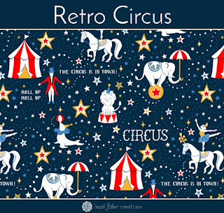
Roll up, roll up! The Circus is in town!
For the next 4 weeks Spoonflower's design challenges each have a theme based around the circus; Retro Circus, Animal Alphabet, Circus Performers, and Big Top Treats.
I'm having lots of fun working on these designs, although they are challenging too. All the contests are limited colour palette and the colours aren't necessarily ones I would have chosen myself. However, the restricted choice of colours has forced me to think carefully about my designs and I actually really like the colours in this one now!

I gave myself plenty of time to start work on my circus designs and I've enjoyed having more time and less pressure to complete the first one (which amazingly I entered into the contest early, not on the last day like usual!).
Due to the limited colour palette, I decided to create my circus designs in vector format. (It would have been impossible to create watercolour designs with precisely the right hex codes.) I wanted my design to still have a hand drawn feel to it though, so sketched each of the elements in pencil first and used these as the basis for my vector drawings. Working in vector has also enabled me to easily change colours and try out different ideas.

I filled in the spaces between the main circus characters with swirls of dots and stars to suggest a sense of movement to the design.
I'm happy with how this one has turned out and I hope you like it too!

There are lots of other great entries to the contest, I'm always amazed to see the creative ideas other people come up with! It's also really interesting to see how everyone has used the colours in this limited palette contest too.
*** Update 6th July 2017 ***
I was thrilled to hear today that my design placed 8th in the results! It was so unexpected because when I saw all the other entries there were so many great ones - I didn't even think I could make it into the top 25 this time! Thank you so much if you voted for my design! My design is now available to buy from Spoonflower - the photos below show how the design looks printed onto fabric...
Buy my fabric on Spoonflower here >> Retro Circus
I also recommend you take a look at the other winning designs - find them on Spoonflower here.

For the next 4 weeks Spoonflower's design challenges each have a theme based around the circus; Retro Circus, Animal Alphabet, Circus Performers, and Big Top Treats.
I'm having lots of fun working on these designs, although they are challenging too. All the contests are limited colour palette and the colours aren't necessarily ones I would have chosen myself. However, the restricted choice of colours has forced me to think carefully about my designs and I actually really like the colours in this one now!

I gave myself plenty of time to start work on my circus designs and I've enjoyed having more time and less pressure to complete the first one (which amazingly I entered into the contest early, not on the last day like usual!).
Due to the limited colour palette, I decided to create my circus designs in vector format. (It would have been impossible to create watercolour designs with precisely the right hex codes.) I wanted my design to still have a hand drawn feel to it though, so sketched each of the elements in pencil first and used these as the basis for my vector drawings. Working in vector has also enabled me to easily change colours and try out different ideas.

I filled in the spaces between the main circus characters with swirls of dots and stars to suggest a sense of movement to the design.
I'm happy with how this one has turned out and I hope you like it too!

There are lots of other great entries to the contest, I'm always amazed to see the creative ideas other people come up with! It's also really interesting to see how everyone has used the colours in this limited palette contest too.
*** Update 6th July 2017 ***
Buy my fabric on Spoonflower here >> Retro Circus
I also recommend you take a look at the other winning designs - find them on Spoonflower here.


No comments:
Post a Comment